


Task: Redesign the logo and develop a corporate identity for Latvian language courses.
The company plans to use the new logo in various contexts, from the icon for the mobile application and website to printing on banners and souvenir products.

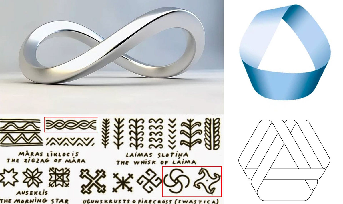
The previous logo was based on the infinity symbol, which illustrates continuous connection. In the new logo, I decided to use a Möbius strip, which is also an object with no end.
The logo based on the Möbius strip resonates with traditional Latvian symbols and ornaments.
The new logo consists of a symbol and font logo. They can be used both together and separately.
The main color is close to the color of the Latvian national flag, but slightly cooler. 🇱🇻


Thank you for watching! 🤗


